Ways in which our media project uses forms and conventions of real media projects is through the common motifs used. One of the motifs we used was ritual celebration. This was the central part of our music video as it was set at a sleepover/party, with drinking and dancing which would appeal to our target audience, as they are teenagers and young adults, therefore representing teen culture. Another motif we used was sexual objectification, which nowadays takes over a majority of music videos as you can't really turn over to a music channel, without seeing girls represented in a provocative way. Women are seen as sexual objects which in some way they are seen as that in our video. In addition we used intertexuality, this is when art is recognizing themselves as art and in turn involving the audience into whatever is going on in the music video which we do when Sam (Katy Perry) winks at the camera. It is drawing the audience into the music video and making them want to see what happens next.
Furthermore, we made our video short enough that the audience wouldn't get bored but long enough for them to understand the narrative and to make a lasting impression, as it was found that the average persons waits 7 seconds before changing the channel.Ways in which our music video challenges the conventions and forms of real music videos is through the narrative, which is about a girl kissing another girl which can still be seen as a controversial thing in the music industry today as it is still seen as a sensitive topic in society.
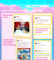
 The combination of our main project and ancillary texts is very effective. For the album cover we used a vary of colours including purple, Blue and red to portray that fun girly image of Katy Perry. Just as in the music video we added a coloured effect to some of the clips which links the to the album cover . One of the album covers is of lips obviously linking to the song and another is of Katy Perry kissing a mirror representing the narrative of the music video. In addition the webpage uses a lot of colours to show the fun side of Katy Perry. Here is a print screen of one part of the website.
In addition we also made a radio spot, showing just how popular Katy Perry really is. Also by making a radio spot it increases her fanbase.
From the audience feedback I have learnt that the favourite part of the Music video was the 4 screen part, which we used twice in the Music Video, once when showing different aspects of the girls putting on Makeup and another when Katy Perry was singing. The audience probably enjoyed this part of the Music Video because it is was quite imaginative. Although we did find that at one point the narrative was quite confusing for one member of the audience, therefore if we were to make a video next time we should ensure the narrative is not too complex. We also learnt that people like special effects such as slow motion as it draws their attention to the Video. However It was apparent that we could have added more special effects, as although we added slow motion and the audience liked the reverse at the end, especially when they saw the writing disappear ,we could have added more effects to make the video more interesting. In addition we did appeal to our target audience as most of the feedback we got was positive probably because there was ritual celebration which teens like to see. Most of the audience would have recommended this video to their friends apart for one because it was not the type of music they would listen to. All together the feedback from the music video was positive, and has taught me to ensure that a music video is eye catching and always appeals to the audience.
How did you use technologies in the construction and research, planning and evaluation stages?
To edit the music video we used Adobe Premier which allowed us to add special effects e.g.(when we added slow motion and a cloured effect to some of the clips, to portray the image of Katy Perry). Other programs we used to make the music video were Adobe after Effects to do the green screen. This allowed me to import the wanted background and then import it into the music video. In addition, PowerPoint was used to show how the album cover was made and website etc. The program used to make the album cover was Photoshop. To plan how we were going to do filming and editing and what was going to be needed, for the projecct, we used the master catalogue which allowed us to add what characters were going to be in the Music video and props and calander to organise our time efficiently. Prezi was also used in many stages of the project. Adobe Premier was also used to edit the Evaluation MTV Show.
No comments:
Post a Comment