In what ways does your media product use, develop or challenge forms and conventions of real media products?
 My media product this year involved me making a music video for our chosen artist. The song we chose to do was 'I kissed a girl' by Katy Perry. Having learned beforehand what a good music video consists of we tried to incorporate a range of different media conventions relevant to our music video in order to portray a modern and quirky image that would appeal to our target audience, but also reflect the image of Katy Perry.
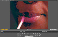
In our music video we have used a variety of common motifs seen in everyday music videos such as fragmentation of the body. This includes the eyes, legs and lips, most which are associated with makeup and applying it. Fragmentation of the body was used in our music video, as it is a form of showing sexual objectification as well as drawing the audience in and maintaining their attention. Since the music video featured all girls, it was important to display signs of sexual objectification without being inappropriate or unsuitable. Other motifs also included ritual celebrations. The music video is set in a house where four girls are at a sleepover/gathering. Typically there is alcohol, food and make up; the main aim was to portray we were having fun and enjoying ourselves. This way our audiences will enjoy watching the video. The music video also features intersexuality, which is art recognizing itself as art. Several times in the music video Katy Perry will look directly into the camera as though she were looking at the audience, or she will look in the mirror. This is effective because it highlights that the artist is aware her surroundings aren't real and that she is in a music video while involving the audience as well.
We have developed some of these motifs in the sense that the music video is about two girls that 'get together', which pushes the boundaries of sexualisation. This is also a way of challenging it as well. Modern audiences are more used to seeing same sex couples in music videos however controversy is sometimes still associated with these images. We have therefore challenged the norm for that reason. We did this because it makes the music video more interesting and less predictable. By doing things that are unexpected we hope that our target audience will admire this and stay tuned into the music video.
How effective is the combination of your main product and ancillary texts?
With our main product being the music video, we have combined many other aspects of ancillary texts to improve the effectives of our company and the promotion of Katy Perry. We produced a radio spot using garage band that is available to hear on YouTube. As well as that there is a website we designed which showcases many different things about Katy Perry, i.e. her bio, pictures of her, twitter account etc. The website is a very good reflection of Katy Perry's image because of the layout and style of the website. We wanted to maintain a fun, bubbly and girly image so used bright, fun colours like pink, purple and blue. Consistency was very important which is why tried to use this theme throughout our media product.
In addition, we made a blog, which all the work we do goes on. This is very helpful and practical because it aids in the organisation and management of all our work. We are able to keep track of what we have done using the blog especially because everything is in order and can be posted accordingly.
What have you learned from your audience feedback?
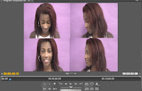
 After we had finished making our music video, part of our project required us to ask members of our target audience to view it before releasing it and putting it on YouTube. This is also known as a test audience. We asked two girls and two boys to watch the full length of the music video. We then interviewed people individually; asking them a series of questions about what they thought of the music video and how it could be improved. From the audience feedback we learnt that our green screen could have been better, perhaps if we had used an animated image in the background instead of a still one. This would have made the video more interesting and of a higher standard. Our test audience said they understood the narrative because it was easy going and related well to the lyrics of the song. Although one member did get lost in the narrative at one point but managed to grasp the meaning in the end. Some of the test audience did mention some problems with the lip-syncing and that it could have been more in sync with the music. However they did like the four-screen image of Katy Perry because it was unique and fun. Our audience also noticed the special effects. They commented on our use of slow motion and increasing the speed in some of the clips, which we did to add to the effect of the music video.
During our research/planning stage of our media product a majority of our information was gathered using a computer. We used a number of different sites to research information about Katy Perry and her music; this helped us decide what song to choose. Part of the planning process required us to make a master catalogue and a calendar using a software called Celtx. The reason why we made a master catalogue and a calendar was to help keep the group organised so that we could manage our time efficiently. Making our music video required using a camera which is what all our filming was done on including, vlogs, interview and podcasts. As you can see the use of cameras has played a huge part in the construction of our music video, as without it we would not have been able to make our music video. The process of editing the music video was done using a mac computer, and the software we used to do this was Adobe Premiere Pro. This software was very assessable and easy to use having used it during AS.
w did you use media technologies in the research/planning, construction, and evaluation stages?
Samantha Eneli

No comments:
Post a Comment