Wednesday, 23 May 2012
Monday, 21 May 2012
Website
http://www.all-saints.bardaglea.org.uk/media_cw/Katy_Perry/Welcome.html
Here is the Katy Perry website we created.
Here is the Katy Perry website we created.
Sunday, 20 May 2012
Saturday, 19 May 2012
Thursday, 29 March 2012
EVALUATION: Write up- Alexandra
Ways in which our media project uses forms and conventions of real media projects is through the common motifs used. One of the motifs we used was ritual celebration. This was the central part of our music video as it was set at a sleepover/party, with drinking and dancing which would appeal to our target audience, as they are teenagers and young adults, therefore representing teen culture. Another motif we used was sexual objectification, which nowadays takes over a majority of music videos as you can't really turn over to a music channel, without seeing girls represented in a provocative way. Women are seen as sexual objects which in some way they are seen as that in our video. In addition we used intertexuality, this is when art is recognizing themselves as art and in turn involving the audience into whatever is going on in the music video which we do when Sam (Katy Perry) winks at the camera. It is drawing the audience into the music video and making them want to see what happens next.
Furthermore, we made our video short enough that the audience wouldn't get bored but long enough for them to understand the narrative and to make a lasting impression, as it was found that the average persons waits 7 seconds before changing the channel.Ways in which our music video challenges the conventions and forms of real music videos is through the narrative, which is about a girl kissing another girl which can still be seen as a controversial thing in the music industry today as it is still seen as a sensitive topic in society.
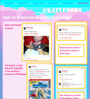 The combination of our main project and ancillary texts is very effective. For the album cover we used a vary of colours including purple, Blue and red to portray that fun girly image of Katy Perry. Just as in the music video we added a coloured effect to some of the clips which links the to the album cover . One of the album covers is of lips obviously linking to the song and another is of Katy Perry kissing a mirror representing the narrative of the music video. In addition the webpage uses a lot of colours to show the fun side of Katy Perry. Here is a print screen of one part of the website.
In addition we also made a radio spot, showing just how popular Katy Perry really is. Also by making a radio spot it increases her fanbase.
From the audience feedback I have learnt that the favourite part of the Music video was the 4 screen part, which we used twice in the Music Video, once when showing different aspects of the girls putting on Makeup and another when Katy Perry was singing. The audience probably enjoyed this part of the Music Video because it is was quite imaginative. Although we did find that at one point the narrative was quite confusing for one member of the audience, therefore if we were to make a video next time we should ensure the narrative is not too complex. We also learnt that people like special effects such as slow motion as it draws their attention to the Video. However It was apparent that we could have added more special effects, as although we added slow motion and the audience liked the reverse at the end, especially when they saw the writing disappear ,we could have added more effects to make the video more interesting. In addition we did appeal to our target audience as most of the feedback we got was positive probably because there was ritual celebration which teens like to see. Most of the audience would have recommended this video to their friends apart for one because it was not the type of music they would listen to. All together the feedback from the music video was positive, and has taught me to ensure that a music video is eye catching and always appeals to the audience.
How did you use technologies in the construction and research, planning and evaluation stages?
To edit the music video we used Adobe Premier which allowed us to add special effects e.g.(when we added slow motion and a cloured effect to some of the clips, to portray the image of Katy Perry). Other programs we used to make the music video were Adobe after Effects to do the green screen. This allowed me to import the wanted background and then import it into the music video. In addition, PowerPoint was used to show how the album cover was made and website etc. The program used to make the album cover was Photoshop. To plan how we were going to do filming and editing and what was going to be needed, for the projecct, we used the master catalogue which allowed us to add what characters were going to be in the Music video and props and calander to organise our time efficiently. Prezi was also used in many stages of the project. Adobe Premier was also used to edit the Evaluation MTV Show.
EVALUATION write up- Samantha
In what ways does your media product use, develop or challenge forms and conventions of real media products?
 My media product this year involved me making a music video for our chosen artist. The song we chose to do was 'I kissed a girl' by Katy Perry. Having learned beforehand what a good music video consists of we tried to incorporate a range of different media conventions relevant to our music video in order to portray a modern and quirky image that would appeal to our target audience, but also reflect the image of Katy Perry.
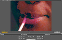
In our music video we have used a variety of common motifs seen in everyday music videos such as fragmentation of the body. This includes the eyes, legs and lips, most which are associated with makeup and applying it. Fragmentation of the body was used in our music video, as it is a form of showing sexual objectification as well as drawing the audience in and maintaining their attention. Since the music video featured all girls, it was important to display signs of sexual objectification without being inappropriate or unsuitable. Other motifs also included ritual celebrations. The music video is set in a house where four girls are at a sleepover/gathering. Typically there is alcohol, food and make up; the main aim was to portray we were having fun and enjoying ourselves. This way our audiences will enjoy watching the video. The music video also features intersexuality, which is art recognizing itself as art. Several times in the music video Katy Perry will look directly into the camera as though she were looking at the audience, or she will look in the mirror. This is effective because it highlights that the artist is aware her surroundings aren't real and that she is in a music video while involving the audience as well.
We have developed some of these motifs in the sense that the music video is about two girls that 'get together', which pushes the boundaries of sexualisation. This is also a way of challenging it as well. Modern audiences are more used to seeing same sex couples in music videos however controversy is sometimes still associated with these images. We have therefore challenged the norm for that reason. We did this because it makes the music video more interesting and less predictable. By doing things that are unexpected we hope that our target audience will admire this and stay tuned into the music video.
How effective is the combination of your main product and ancillary texts?
With our main product being the music video, we have combined many other aspects of ancillary texts to improve the effectives of our company and the promotion of Katy Perry. We produced a radio spot using garage band that is available to hear on YouTube. As well as that there is a website we designed which showcases many different things about Katy Perry, i.e. her bio, pictures of her, twitter account etc. The website is a very good reflection of Katy Perry's image because of the layout and style of the website. We wanted to maintain a fun, bubbly and girly image so used bright, fun colours like pink, purple and blue. Consistency was very important which is why tried to use this theme throughout our media product.
In addition, we made a blog, which all the work we do goes on. This is very helpful and practical because it aids in the organisation and management of all our work. We are able to keep track of what we have done using the blog especially because everything is in order and can be posted accordingly.
What have you learned from your audience feedback?
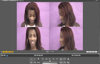 After we had finished making our music video, part of our project required us to ask members of our target audience to view it before releasing it and putting it on YouTube. This is also known as a test audience. We asked two girls and two boys to watch the full length of the music video. We then interviewed people individually; asking them a series of questions about what they thought of the music video and how it could be improved. From the audience feedback we learnt that our green screen could have been better, perhaps if we had used an animated image in the background instead of a still one. This would have made the video more interesting and of a higher standard. Our test audience said they understood the narrative because it was easy going and related well to the lyrics of the song. Although one member did get lost in the narrative at one point but managed to grasp the meaning in the end. Some of the test audience did mention some problems with the lip-syncing and that it could have been more in sync with the music. However they did like the four-screen image of Katy Perry because it was unique and fun. Our audience also noticed the special effects. They commented on our use of slow motion and increasing the speed in some of the clips, which we did to add to the effect of the music video.
During our research/planning stage of our media product a majority of our information was gathered using a computer. We used a number of different sites to research information about Katy Perry and her music; this helped us decide what song to choose. Part of the planning process required us to make a master catalogue and a calendar using a software called Celtx. The reason why we made a master catalogue and a calendar was to help keep the group organised so that we could manage our time efficiently. Making our music video required using a camera which is what all our filming was done on including, vlogs, interview and podcasts. As you can see the use of cameras has played a huge part in the construction of our music video, as without it we would not have been able to make our music video. The process of editing the music video was done using a mac computer, and the software we used to do this was Adobe Premiere Pro. This software was very assessable and easy to use having used it during AS.
w did you use media technologies in the research/planning, construction, and evaluation stages?
Samantha Eneli
EVALUATION Write-up - Lauren Wright
 |
| Fragmentation of the body |
 |
| Bright, feminine design of the website |
 |
| Pop art effect of the album cover |
 |
| Ritual celebration aspects in the video, favoured by the audience |
 |
| Adobe Photoshop |
 |
| The radiospot in Adobe Premiere |
Wednesday, 28 March 2012
Updating one of the album covers
Tuesday, 27 March 2012
Saturday, 24 March 2012
Tuesday, 21 February 2012
EVALUATION:Music Video Effects
Fade out/in: These effects were used several times throughout our music video particularly at the end and the beginning. Fade white was used at the beginning of the music video to show Katy Perry was remising about the night before. Whereas the fade to black was used at the end to highlight the video had come to an end.
Speed: In terms of the speed of our music video we used several tools to alter it. Including slow motion, reversing the speed and speeding it up. We featured these effects in different aspects of the music video to emphasise particular scenes and shots. For example, towards the end of the music video we reversed a number of the clips used earlier on. This was done to give some sense of a build up towards the final shots which showed the final ending to the story.
Change Colour: To compliment the theme of the video we changed the colour of some of the clips to make them look more colourful and added a solarize effect. As a group we felt this would fit well with the image of Katy Perry and overall portrayal of her and the music video. The screen shots below show various examples of it being used.
Saturday, 18 February 2012
Friday, 17 February 2012
Thursday, 16 February 2012
EVALUATION -How does your project challenge real media texts?
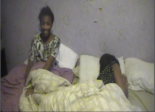 One way in which our media project challenges real media text is through our narrative. As it is based on a girl reminising about kissing another girl. In the industry today it is still seen as a sensitive subject, that is not seen in many music video, as it is contraversial. However this does link to sexual objectification which is found in most music video, therfore showing our music video is similar to other media texts.
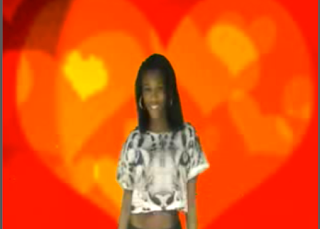
Another way in which our project challenges real Media texts is thorugh our green screen. Green screen is not really used in all music video, therefore making our music video stand out.
EVALUATION- What we have learned from audience feedback? - Lauren Wright
PODCAST Which aspects of the music video were most successful in attracting the target audience? & What aspects of the music video need work or should to attract your audience?
What are your expectations of your target audience?
I believe that the target audience find the video interesting as we have created the video on the basis of the results of our research about music videos with our target audience. I think they will enjoy the video as it follows a strong narrative which according to our results is what entices the audience. Similarly, we incorporated a party scene within the video as we found that ritual celebration was a popular motif amongst the target audience, therefore we felt this would be a popular part of the video which will attract the audience. It was also noticeable that a significant amount of people that we asked as part of our research, preferred to watch controversial music videos as it makes them more interesting and increases the likelihood of them watching the entire video. In light of this, we included some controversial aspects into the film such as when the artist licking the icing of the cupcake and when she almost kisses a girl, in order to attract the target audience.
What aspects of target audience research do you find most challenging?
It is difficult to carry out research on music videos on a specific target audience as although they are all similar in some way such as age or gender, it is highly likely that the majority of them will have different tastes in music. Consequently, different music genres have different types of music videos and therefore, it is difficult to create a music video which will appeal to the entirety of our target audience. To overcome this, we chose to go with majority's opinion when incorporating our results into our final product.
What methods do you find most successful in attracting your target audience?
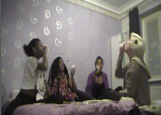 It was noticeable from viewing our test audience video and interview people that had watched our music video that the four-screen technique we incorporated with the artist singing attracted the audience. They liked the fact that it was different and stood out from anything else they had seen in other previous music videos.
Also, it was evident that the party aspect of the video was popular amongst the target audience. We predicted this would be the case after conducting research prior to creating the video and finding that ritual celebration was a popular motif for music videos.
I believe that the target audience find the video interesting as we have created the video on the basis of the results of our research about music videos with our target audience. I think they will enjoy the video as it follows a strong narrative which according to our results is what entices the audience. Similarly, we incorporated a party scene within the video as we found that ritual celebration was a popular motif amongst the target audience, therefore we felt this would be a popular part of the video which will attract the audience. It was also noticeable that a significant amount of people that we asked as part of our research, preferred to watch controversial music videos as it makes them more interesting and increases the likelihood of them watching the entire video. In light of this, we included some controversial aspects into the film such as when the artist licking the icing of the cupcake and when she almost kisses a girl, in order to attract the target audience.
What aspects of target audience research do you find most challenging?
It is difficult to carry out research on music videos on a specific target audience as although they are all similar in some way such as age or gender, it is highly likely that the majority of them will have different tastes in music. Consequently, different music genres have different types of music videos and therefore, it is difficult to create a music video which will appeal to the entirety of our target audience. To overcome this, we chose to go with majority's opinion when incorporating our results into our final product.
What methods do you find most successful in attracting your target audience?
 It was noticeable from viewing our test audience video and interview people that had watched our music video that the four-screen technique we incorporated with the artist singing attracted the audience. They liked the fact that it was different and stood out from anything else they had seen in other previous music videos.
Also, it was evident that the party aspect of the video was popular amongst the target audience. We predicted this would be the case after conducting research prior to creating the video and finding that ritual celebration was a popular motif for music videos.
EVALUATION -How our media project is similar to other media text.
In this clip you will see that I have taken various clips from our Music video which I have then compared to a clip taken from Katy Perry's Last Friday Night. The reason why I have picked both these clips is because thay have many similarities. One being they both protray the common motif 'Ritual Celebration'. This is found in mainly all music videos but it is clear, that in both videos they are having a good time and they want to be there.. Another similarity is that they both potray teen cultue with the drinking and dancing which will appeal to our audience, as this is what they want to see.
By Alexandra Eneli
Wednesday, 15 February 2012
EVALUATION -Test audience Interviews
It was important to question the target audience after previewing the video because we wanted constructive feedback and to make sure we met the audiences needs. Also the types of questions we asked were important, because we had to make sure they were not too complex for the audience and that the answers they gave would actually be useful, if we were to improve on the music video.
By Alexandra Eneli
EVALUATION- Music Video review
From watching her review, we found that we needed to improve on our lighting, which I'm sure she was talking about the bit where were in the bedroom near to the end. As I realised that it looks quite dark compared to all the other scense. Although, apart from that she gave a positive review for everything else, one them being the way in which we presented the narrative. By giving us a positive review, it gives us confidence in making future music videos and lets us know we met our target audience needs.
By Alexandra Eneli
EVALUATION -Test Audience
Here we have the test audience viewing the Video. The importance of having them watch is to see if we get the reactions we wanted first hand and to see if the audience were happy with it.
By Alexandra Eneli
EVALUATION -Survey Monkey Facebook Post -Alex
EVALUATION -Survey Monkey Test Audience Questionnaire
Here is a screenshot of the 6 questions of our questionnaire that I created on Survey Monkey. The reason behind the questionnaire is to get as much feedback as possible, so that we know ways in which we could improve our Music Video. Also to ensure it meets the target audience needs and covered all possible aspects of a Music Video.
 |
| By Alexandra Eneli |
Wednesday, 8 February 2012
Saturday, 4 February 2012
Friday, 3 February 2012
CONSTRUCTION -Music Video Youtube Post
The usefullness of using Youtube to post of our video is that it reaches the target audience as Youtube is global. Million s of people use it. Also it is a cheap way of advertising because we dont have to pay to post our videp on Youtube.
http://www.youtube.com/watch?v=Dkea5lSt918
Katy Perry 'I kissed a Girl Music Video
By Alexandra Eneli
http://www.youtube.com/watch?v=Dkea5lSt918
Katy Perry 'I kissed a Girl Music Video
By Alexandra Eneli
Thursday, 2 February 2012
CONSTRUCTION: Fifth day of editing.
This was our last editing day which involved me putting on the rest of the effects in the music video. I used a colour change and solarize tool to alter the picture of some of the clips. This was just to add a quirky edge to the video and was something I felt went well with the overall theme. Both effects were used throughout the video in various different clips. Towards the end of the music video I edited some of the clips so they ran in the reverse order. This was done to highlight the fact that the music video was coming to an end; a way of showing a quick summary of the night before. The process was long and took a whole lesson to do and more. Nevertheless I was happy with the finished product.
Wednesday, 1 February 2012
Monday, 30 January 2012
CONSTRUCTION: Fourth editing session
This session was another long editing process because there were several empty gaps to fill. Although after I had finished editing all the gaps were filled, it's was just a case of perfecting it and any additional effects will be added later on in the upcoming week. The main thing I focused on today was the mirror scene. This part features Katy Perry writing her lyrics on a mirror with lipstick. To edit this scene I increased the speed of the clip so it was roughly at the same speed of the actual music. Doing this was very straight forward and easy. Overall the editing went very well. The most important thing we wanted to get done was fill the gaps and this was achieved making it a very successful session.
Samantha eneli
Saturday, 28 January 2012
CONSTRUCTION -Fourth day of filming
Today we filmed the rest of what needed to be filmed, as in editing there was a lot of gaps. We had to film scenes that could fill in these gaps, but ensuring they linked in with the lyrics and the whole concept of the music video. Everything seemed to go well, apart from when we were filming a scene in a mirror; we kept getting the camera in the mirror, but we were able to overcome this by doing it from a different angle. There were no serious issues when filming, probably because all the scenes we were filming were all straight forward and nothing too complex. If we are able to fill in all the gaps when editing then we will not need to film anymore and our music video will be done.
By Alexandra Eneli
By Alexandra Eneli
CONSTRUCTION -Email to Record Label - Permission to create music video.
Due to copyright laws, we have to ask our artist's record label for permission to create the music video. Therefore, I contacted Katy Perry's record label (EMI) to request permission stating that the video was for educational purposes only.
Afterwards, I received an email from the licensing assistant for EMI who agreed to our group using the song in our music video for educational purposes only.
Lauren Wright
Wednesday, 25 January 2012
CONSTRUCTION: Third editing session
At this point there were many scenes to edit because in the previous filming session we managed to film a substantial amount for our music video. Having filmed a high angle shot I found this difficult to edit because the footage was quite shaky. However I overcame this problem by applying a slow motion affect to the clip. By doing this, it took the attention away from the shaking and looked much better. I also used the slow motion because it's interesting and adds emphasis to a clip in the sense that it makes the audience pay more attention to what's going on. Our last filming session included continuity as well. This made the editing process much longer than usual because it was important to get the continuity right and on point. Regardless of the time it took I got it done and it was very easy to do. Slow motion was also added to this aspect of the video as well.
Samantha Eneli
Samantha Eneli
Tuesday, 24 January 2012
CONSTRUCTION - Third day of filming
Today we filmed everything else that was left to do. We did it step by step by looking at the storyboard and the lyrics, to ensure the scenes linked with the lyrics. We were able to get everything done, although we did encounter a problem where we wanted to do a high angle shot where it panned all around us, but half of Lauren's body kept appearing in the shot, but we managed to overcome it by her kneeling down while panning it around us. Although we did have to do it a couple of times because sometimes the shot was quite shaky. What we found quite easy was the party scenes as they were quite straight forward to film. All that is left to do is the editing and from there we will be able to see if we need to do any more filming.
Alexandra Eneli
Alexandra Eneli
Wednesday, 18 January 2012
Tuesday, 10 January 2012
Subscribe to:
Comments (Atom)


